
The right colors can make or break your decor. If the choice of colors seems overwhelming, this guide on picking Color Schemes for your Home should help!
The Russian-French painter, Wassily Kandinsky once said, “Color is a power which directly influences the soul“. There’s no doubt about the fact that colors influence you consciously and subconsciously, and can affect your mood, behavior and buying patterns. So when we talk about the colors in your space, it’s no wonder that choosing the right ones is an all-important step! We see gorgeously decorated rooms all around us, in real life and online. We appreciate how the decorator has styled the space using different colors but when it comes to doing the same for our own homes, panic sets in and we freak out! Yes, choosing the right colors for any space is definitely challenging, but all it requires is some understanding of color therapy and patience to do some research. Contrary to what many people think, you can definitely choose color schemes for your home, even if you aren’t an interior designer!
What is Color Therapy?
 Color theory is a collection of rules that help create visually pleasing designs with the right combination of colors. It helps you understand how each color works in relation with another, and what kind of mood the colors create on their own as well as in combination. The basics of color therapy are what we learnt in our early school years – starting with primary colors. These are red, blue and yellow and are considered parent colors. They cannot be created from other colors, but they can be used to create ‘child’ colors. Secondary colors are orange, green and purple, created by combining different primary colors together in equal parts. For instance, blue and yellow combine to form green. Tertiary colors are what you get when you mix secondary colors with primary colors in different amounts. Understandably, you can have several tertiary colors, in many shades. Now that we know the basics, let’s move on to combining colors, i.e. creating color schemes and color palettes. Now, these words are often used interchangeably in design, but they aren’t exactly the same. A color scheme is a broad group of colors that go together based on the rules of color theory. This can be a generic grouping, like red-white-green for Christmas. However, a color palette is the a more defined group that specifies the exact colors you’re going to use in your design. Going with the Christmas example, there are many shades of red and green. A color palette would refine this scheme as something like UE Red-Snow White-Dark Pastel Green.
  When choosing color schemes for your home, you’ll probably select a color scheme first, and then specify it to a color palette. Now, you’re probably wondering if you should just ditch the color wheel and go for an all neutrals look instead. Well, that’s perfectly fine, but I hate to break it to you – even neutral is a color scheme and there are many, many neutral colors out there! Besides, there’s nothing like the right color to instantly perk up a boring room. Changing your color scheme is also an easy way to refresh a room that’s looking tired and stale. Colors also have practical purposes – light colors can enlarge a room while dark colors can shrink it. Yes, Kandinsky was certainly right – color has incredible power! With that power comes the responsibility to choose the right color schemes for your home, and that’s exactly what we’re going to do today!
How to Pick Color Schemes for your Home
1. Understand Color Schemes
 So we saw what color schemes meant and how they differed from color palettes. There are many standard color schemes that determine what colors look best with each other, and these make it really easy for us to match colors. Here are four of the most popular color schemes seen in design today.
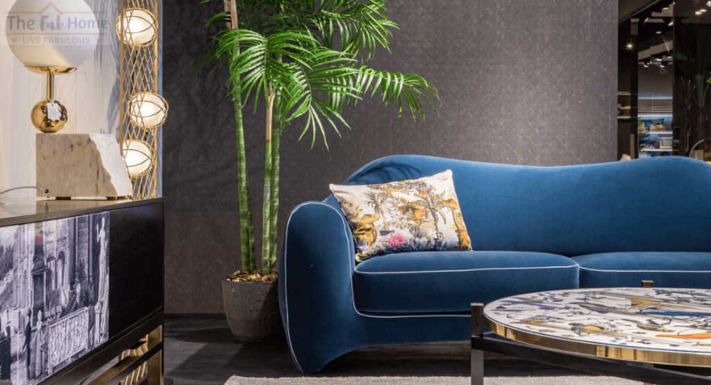
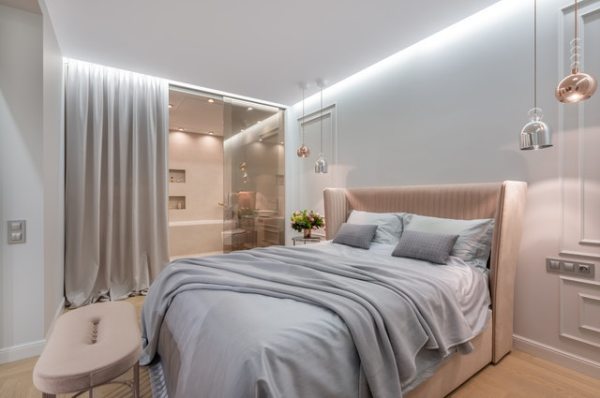
 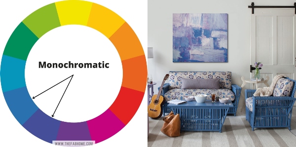 The monochromatic color scheme uses just one color, but different versions of it. A true color is called a hue, and you can add white or black to this hue to get various tints and tones. In this example, the room is decorated in one basic color – blue, but uses different shades and tones of blue across the furniture, cushions and art. This is the easiest and safest color scheme – it is very hard to go wrong with monochromatic. It’s perfect for those who want to play it safe, but it can feel a little dull for others. Monochromatic gives off a relaxing feel, and the more shades, tones and tints you use, the more energetic the space will seem.
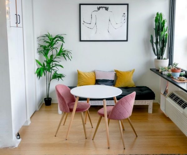
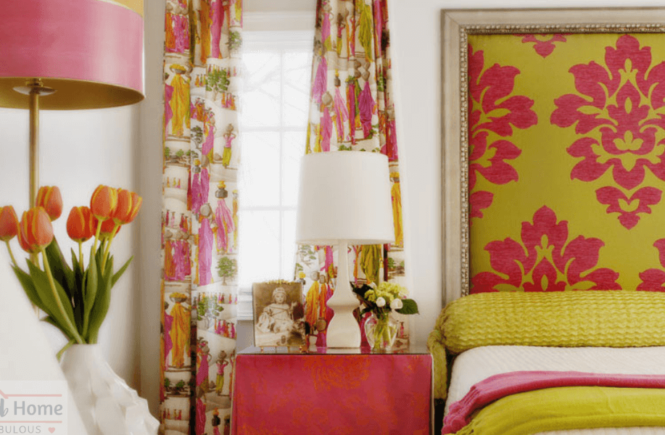
 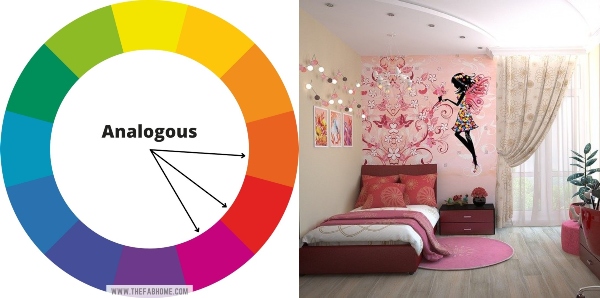 The analogous color scheme features colors lying next to each other on the color wheel. For example, red and orange, blue and green or pink and purple. This way, you get a little more variety in color, while still playing it relatively safe. The analogous color scheme is often found in nature, which makes it pleasing and soothing. This scheme usually includes 2-3 colors, but not more. You can use any tint or tone of the hues you choose. In this example, pink is the main color, with lots of red and tiny bits of orange.
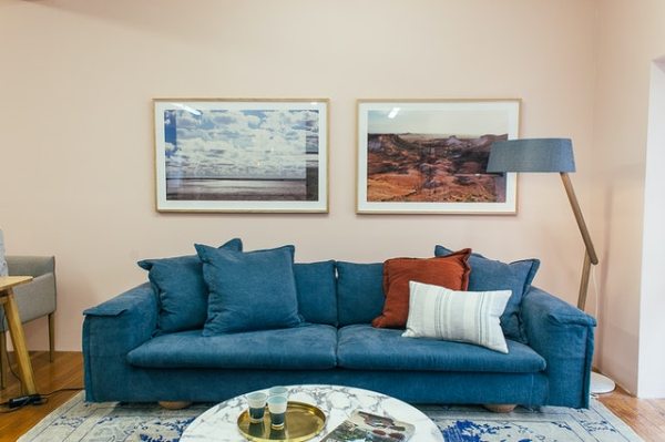
 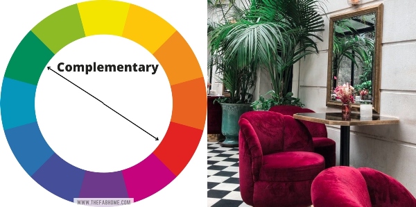 The complementary color scheme includes colors lying opposite to each other on the color wheel. This will give you a more striking color combination that will have a bigger impact on your interiors. This color scheme is also visible in nature, like holly berries and mistletoe or an orange sun in a blue sky. This color scheme will need a little more care in execution, to ensure you get the right tints or tones that match with each other and with the mood of the space.
 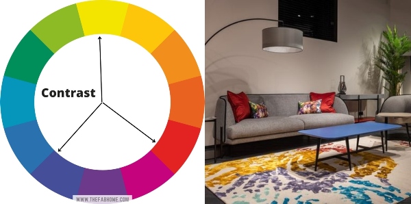 The contrast color scheme is the most dramatic in this list, consisting of three different colors that are evenly spaced on the color wheel. As you can see, the colors that come together are in stark contrast to each other, creating a bold look. This is perfect if you want your space to be one of high energy and joy, but it’s certainly not for the faint hearted! It can also make a space overwhelming if not used properly.
2. Look within Yourself
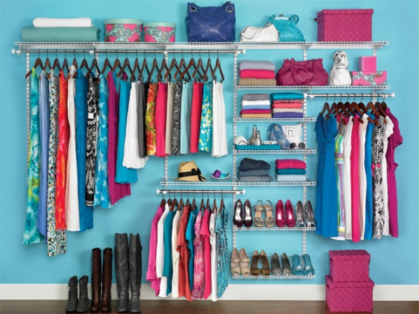 Okay, this sounds deep, but it’s true – if you’re decorating your space, shouldn’t you know yourself first? If there are colors that have always been your favorite, you’re quite likely to be happy if you decorate with them. You could even add another color according to the color wheel, while keeping your favorite color in the limelight. Go down memory lane. Think about places or homes that made you feel happy and which you still think of fondly. When you choose these colors which have a deep connection with your subconscious, they’ll take you to a happy place whenever you step into a space decorated with them. If you’re still unsure, look inside your wardrobe. Do you tend to veer towards certain colors? Or maybe you like certain tones, like pastels. Your wardrobe is an excellent reflection of your tastes and should at least give you a starting point when picking color schemes for your house.
3. Find Inspiration Online
 This is the easiest way to help figure out color schemes for your home. You can go on to Pinterest or Instagram and just a few minutes of scrolling will give you several ideas – for more than color schemes! The trick is to start with an open mind and not with a goal of narrowing down your color palette just yet. Simply go through pictures of living rooms or bedrooms or whatever room you’re decorating and pin whatever appeals to you. Don’t think too much about it, just save what you like. Later, you can go over the pictures you’ve pinned and try to find commonalities between them. Maybe they’re mostly neutrals or maybe you like rooms with more saturated colors. Perhaps you find yourself drawn to blue a little too much. A quick analysis of your saved pictures will give an insight into color schemes that make you happy.
4. Consider the Purpose of the Space
 While color therapy and color schemes help in technically finding colors that work together, we shouldn’t ignore the fact that colors are powerful when it comes to affecting your mood. Colors are more than just hues; they are also emotions. The purpose of the space you’re decorating will help guide you regarding color schemes for the room. For instance, bedrooms should be relaxing and conducive to falling asleep. Kids’ rooms should ideally be more energetic and stimulating. Knowing the effect a color has on you will help determine the right colors for a particular room. Here is a quick look at some common colors and the emotion they reflect:
- Red – energy, happiness, excitement, stimulation
- Orange – enthusiasm, happiness, appetite
- Yellow – joy, creativity, appetite
- Green – calm, freshness, security
- Blue – relaxation, calm, softness
- Purple – luxury, elegance, relaxation
- Brown – stability, security, warmth
- Black – elegance, luxury, modernism
- Gray – practicality, elegance, simplicity
- White – simplicity, minimalism, peace
5. Consider the Color Value
6. Pick Colors from a Particular Piece
7. Spread out the Colors
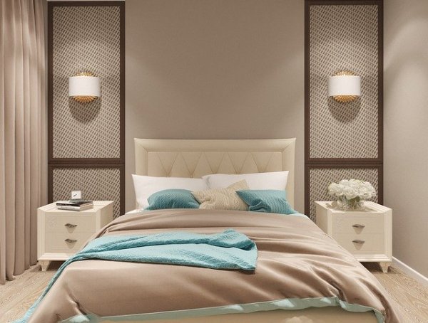
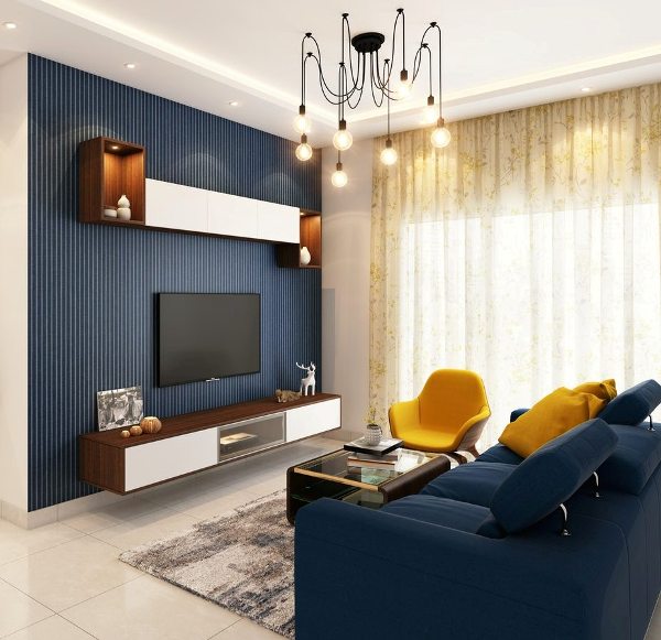 Okay, so you’ve finally found the colors you’re going to use in your space. Now where do you use these colors? Which one goes on the wall? Which color should the rug be? What about the sofa? Yes, all valid questions, and rather maddening ones too! While you have a free hand in choosing the colors you want to decorate with, design experts don’t recommend choosing less than 3 colors or more than 5 colors. Fewer than 3 will make the place too bland, and too many will overwhelm the space. The general tip when choosing three colors is to use them in a 60-30-10 concentration. The main color is ideally the lightest color, a neutral that occupies 60% of the room, mainly on the walls. The secondary color should be a mid-tone color occupies 30% of the room and can be used in accent walls. The brightest colors should be seen in 10% of the room, so they don’t end up being overbearing. If you’re choosing five colors, you can have two neutrals as well as two bright colors and balance the percentage accordingly. Be careful with the bright colors, using one more sparingly than the other, as pops here and there. Look at the image above: ivory is the main color, which is on the walls, floor and rug as well as furniture panels. Blue is the secondary color, on an accent wall and the sofa, while yellow is the accent color on the chairs and cushions. Black also makes a presence in the chandelier and the coffee table.
8. Consider your Decor Style
 Are you forgetting about your preferred decor styles when deciding color schemes for your home? If you have settled on a decor style but are having trouble deciding colors, look at the decor style you’ve chosen – you’ll get some hints in there. For instance, coastal styles are mostly different shades of blue and lots of white with light woods. A nautical style uses a good amount of navy and red along with white. A bohemian style will feature various browns and beiges, while minimalists veer towards plenty of whites and grays. Of course, you don’t have to be a purist and stick to these colors alone. You can certainly mix styles or go for a style that includes different elements like art deco, kitsch or eclectic. You can also checkout the latest home design trends for 2022 before making a decision on style.
9. Pick the Paint Last
 It’s very tempting for us to choose the wall color first and then move on to the other parts of the room. Unfortunately, that’s the worst thing to do when choosing color schemes for your home! The thing is, the availability of wall paints should be the last thing on your mind – you should get the colors YOU want! Paint colors can be mixed to create any shade – remember our lesson on tertiary colors at the beginning? Once you have a color palette down and you’ve decided which color goes on the wall, you can mix paints to get exactly the color you want. Doing up a room can be exhausting, so spend your initial energy and enthusiasm in finding the perfect rug, sofa and furnishings. The paint can always be bought later, without having to compromise on your color scheme.
10. Don’t forget Lighting
 No, we’re not talking about buying lighting fittings – we’re still with color schemes for your home! The thing is that lighting plays an important role in how your colors look in your home, especially wall paint. Color is intimately related to light. After all, the rainbow is formed by sunlight passing through a prism. Light reflects color, so how your wall looks in daylight will be quite different from the way it appears at night. Changing seasons can also change the way the color appears.
11. Keep it Cohesive
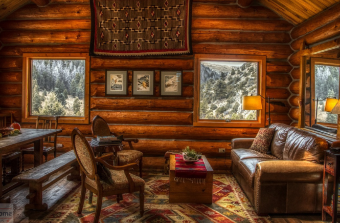
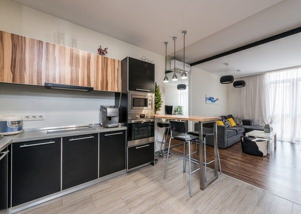 Have you ever been in a home where walking from one room to another made you feel like you were walking into another home altogether? That’s why cohesion is so important when it comes to picking color schemes for your home. That’s not to say that every room in your house should look exactly the same – that would be too boring! Keeping things cohesive just makes everything feel connected but it should be done in a very subtle way by carrying across colors, textures or accents. Color is obviously the easiest way to do this, particularly if you have an open floor plan. In the image above, the black carries across the kitchen, the chairs to the living room and probably beyond. So even though the flooring changes, the common color scheme makes everything look well put together and creates a more relaxing look. This also works when you don’t have an open floor plan, and is particularly helpful if you have a small home. A cohesive color scheme makes your home look more expansive and makes the decorating feel intentional.
 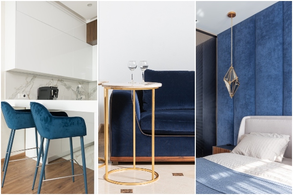 Repetition is one of the main tips in decorating, and it is recommended to repeat colors and patterns through a home to give it cohesion. Look at the home in the picture above. Blue is a recurring color, but it is not in the same way – for instance, the walls are not painted blue in all rooms. The kitchen has blue chairs, the living room has a blue sofa while the bedroom has an upholstered wall in blue.
12. Consider your Commitment Level
 Okay, so you’ve got a lot of inspiration and tips for choosing color schemes for your home. But, you’re a bit of a commitment-phobe – at least when it comes to colors! That’s perfectly fine – I admit, I’m a bit like that too! Maybe you’re not sure you’ll like this color in a few months, or you like changing up the look of your home frequently. If that’s the case with you, choose a color scheme that focuses mainly on neutrals like beiges, greys, creams and light browns. So that should take care of the 60% and 30% mentioned in point no. 7 above. Keep the remaining 10% for your experiments with color. Let this 10% be in things you can change up easily, like cushion covers, throws, vases and art work. You can also use items like books, flowers and fruit to add pops of color around the space. This way, you can also change up the look completely for festivals and holidays without spending a bomb.
13. Use a Paint Color App
 If your phone can help wake you up, store your ideas, send email and track your heartbeat, it can certainly figure out a color palette for you! There are many apps out there today that can help you in the difficult task of figuring out color schemes for your home.
ColorSnap is one such app that can create a color palette from any photo you upload into it. Loomatix is a similar app that ‘grabs’ colors from any place you are in. Visualize Color helps you virtually paint a room in any color so you can get an idea of how that room will look.
If you’d like to start from scratch, check out Color Scheme Designer that has a color wheel you can spin to find matching color schemes. Canva is another excellent tool that figures out the colors in a picture and also helps you create a mood board for a room.
14. Use Color in Fun Ways
 Remember the point about repetition and keeping thing cohesive? You can do this by adding a few small details in your color palette around the home. Inserting your colors in unexpected places will add interest to your space and give it a unique charm of its own. There are many ways to go about this. You can of course, paint an accent wall or wallpaper it in your chosen color. Paint the legs of furniture or the bed’s headboard. Instead of an accent wall, you can also try painting a wall or window trims. Another fun tip is to paint or wallpaper the insides of your shelves. Also try mixing things up like having dining chairs in different colors.
15. Do your Homework
 I know this goes without saying, but before you buy anything for your home, make sure you do your homework thoroughly. Do enough research and find out your color palette with 3-5 colors. Figure out exactly where each color will go, and create a mood board for a more visual idea. Make a list of the things you already have and what you need to buy. Maybe all you need to do is polish or paint a piece to make it match your new color scheme. Always get swatches for everything before buying the full item. If you’re confused between color schemes, create mood boards in each and see how you feel about them. This will most probably help you arrive at a decision.
 Deciding upon color schemes for your home is an important part of setting up on space, and this single decision decides the direction for the other decisions to follow. This may put immense pressure on you, but remember – choosing your colors should be an enjoyable process, not a stressful one! Please remember that these are guidelines to help ease the process of choosing a color palette, and nothing more! At the end of the day, it’s your space and you have the freedom to do whatever you like. So listen to your heart and you won’t go wrong!

4 Comments
What a brilliant article on choosing the colour scheme for one’s house! Thank you for the numerous suggestions.
Detailed write up on colour schemes.
Lovely writeup !